
A screen proof can be useful, but it is not the final box. Once ink meets paper, the result starts to depend on the stock, the press, and whatever finishing comes afterward. A burgundy that looks deep on screen may print flatter on one paper and stronger on another. That is why the artwork file and the printed sample need separate approval.
The CMYK or Pantone decision usually becomes clearer once the artwork is broken down. A box with photography, gradients, and several colors has different needs from one built around a single brand shade. The paper and finishing matter too, especially if the same box will be produced again later and needs to stay visually close to the first run.
What Is the Difference Between CMYK and Pantone in Wine Box Printing?
Think about two common jobs. One wine box carries a vineyard image, several shadows, and a wide color range. Another is mostly one dark red with a small foil logo. The first will usually suit CMYK. The second may benefit from a Pantone spot color, particularly when the red needs to stay close to an approved reference.
How CMYK Builds Printed Color
CMYK relies on four inks: cyan, magenta, yellow, and black. Most full-color packaging artwork is built from those four inks.
A vineyard image is a simple example. The file may show green leaves, brown soil, blue sky, dark shadows, and dozens of smaller color changes. The press does not need a separate ink for each of them. Those tones are built from the same four process inks.
The screen preview can still be misleading. RGB colors come from light, while printed colors come from ink sitting on paper. Some bright colors lose strength after conversion; others move slightly warmer or cooler. That check belongs in prepress, before the job reaches the production run.
How Pantone Spot Colors Work
Pantone is more useful when the job depends on a specific solid shade. Instead of building that color only from CMYK percentages, the printer works toward a named spot-color reference.
For a wine box, this often matters with logos, dark background colors, or a brand shade that appears across several packaging formats. The reference gives the printer a clearer target, although the paper and finishing still affect what the customer finally sees.
When CMYK and Pantone Can Be Used Together
A project does not always need to choose only one system.
A wine box may use CMYK for photographs, illustrations, or gradients and a Pantone color for the main logo or a large solid brand panel. Foil stamping, embossing, debossing, or spot UV can then be added as separate finishing processes.
This mixed approach can be effective when the design combines complex imagery with a small number of colors that require closer control.
Which Printing Method Fits Different Wine Box Designs?
The best printing method depends on the visual structure of the artwork. Before approval, separate the design into photographs, gradients, solid colors, text, decorative details, and finishing areas.
| Photographs | Well suited | Usually unnecessary |
| Gradients | Well suited | Limited for complex gradients |
| Multiple artwork colors | Efficient | Less practical as color count increases |
| Specific brand color | Possible with controls | Strong reference for spot colors |
| Large solid areas | Suitable | Often useful |
| Repeat color reference | Requires controlled process | Clear named reference |
Multi-Color Artwork and Photography
CMYK is generally the practical choice for detailed illustrations, photography, seasonal graphics, and layouts with several colors.
The project team should still review dark areas, neutral grays, and saturated colors after conversion. Fine tonal differences that look clear on a backlit screen may appear differently on printed paper.
Logos and Brand-Specific Colors
A logo with a defined corporate color deserves separate consideration.
If the visual identity depends on one particular red, blue, green, burgundy, or other signature shade, Pantone may provide a clearer production reference than an approximate screen value.
The print specification should record the selected Pantone reference, substrate, surface treatment, and approved sample. This creates a more useful standard for both the first order and future repeat production.
Minimalist Premium Packaging
Minimalist packaging may use fewer colors, but that does not make color control less important.
With fewer visual elements on the box, small color differences can stand out more clearly. A large burgundy panel or a single foil logo leaves less visual detail to hide a shift in tone.
Paper and finishing also become more important in this type of design. The same dark shade can feel different on smooth white stock, textured paper, or a laminated surface, so the color should be judged as part of the finished material combination.
Why Can the Same Color Look Different on Different Wine Box Materials?
Put the same ink on three different papers and the result will not look identical. A coated white sheet, an uncoated stock, and kraft paper each affect the color in their own way.
Coated and Uncoated Paper
Coated paper tends to keep more ink at the surface, giving solid areas a cleaner and stronger appearance.
Uncoated paper absorbs more of the ink into its fibers. The result is often softer, especially with dark backgrounds or large fields of color. A shade approved on coated stock should not be assumed to look the same after the paper changes.
Kraft and Naturally Colored Paper
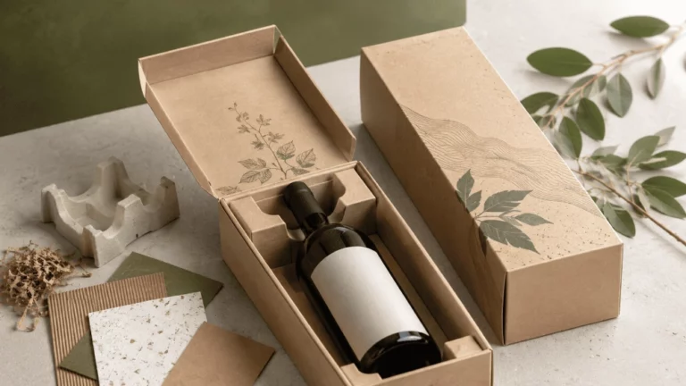
Kraft and other naturally colored papers contribute their own base tone.
Light colors may appear warmer, less bright, or less clean than they do on white coated stock. Some colors may need adjustment because the paper itself influences the result.
Design teams should not approve a kraft-based package only from a white-screen preview. The actual material needs to form part of the color decision.
Textured and Specialty Paper
Textured paper affects both ink coverage and reflected light.
Fibers and embossed textures break up the surface, so solid ink areas may look less even than they do on smooth paper. That is not always a defect; in premium packaging it can be part of the intended effect. The important point is to check it on a real sample before the production run.
How Do Lamination and Finishing Change Printed Color?
The printed sheet is not the finished surface. What happens after printing can change the way the color looks.
Matte lamination reduces reflection and can make strong colors feel more restrained. Gloss lamination reflects more light, so dark or saturated areas may appear richer.
Spot UV creates another contrast because only selected areas receive the glossy layer. Foil is different again. It is a reflective material, not another ink color, and its appearance changes with the light.
Embossing and debossing alter the surface itself, which also changes how light moves across the box. For final approval, it is safer to look at the printed paper and finishing together rather than approve the ink color in isolation.
Why Is a Physical Color Proof Important Before Production?
Digital files are effective for checking artwork placement, text, image position, dielines, and basic color setup. They cannot reproduce every characteristic of the finished package.
Digital Proof vs Physical Proof
A digital proof can confirm whether the correct artwork version is being used and whether the layout aligns with the approved dieline.
A physical proof provides a stronger reference when color and finishing are commercially important. It lets the project team evaluate the selected substrate, printed color, surface treatment, and relationship between the design and the actual box structure. High-priority colors should therefore be judged against a production-relevant reference rather than screen appearance alone.
What Buyers Should Check on a Printed Sample
Review printed samples under consistent lighting and compare them with the agreed color target.
Pay particular attention to large solid areas, dark colors, neutral gray, gradients, small reversed text, logo colors, and printed areas positioned next to foil or spot UV.
If the approved sample will become the production reference, approval should be recorded clearly so the same standard can be used during mass production and repeat orders.
How Is Color Consistency Controlled During Mass Production?
Color control continues after sample approval.
A practical process may include an approved color reference, confirmed material, first-piece inspection, and checks during the production run. Pantone references can define important spot colors, while the approved physical sample can provide a broader visual standard.
Dark colors such as black, deep blue, and burgundy deserve particular attention because visible shifts can become noticeable across large surfaces.
Repeat orders require the same discipline. If the paper, coating, ink system, or finishing changes, the final appearance may also change.
Retaining the approved sample and recording the material and process specification helps prevent a repeat order from becoming a new visual interpretation.
What Should Buyers Specify Before Approving Wine Box Printing?
A clear print specification reduces avoidable revisions.
Before approval, confirm the final dieline, artwork version, print method, Pantone references where required, paper or surface material, lamination, foil, embossing, spot UV, insert requirements, and approved sample standard.
Artwork also needs to be prepared correctly for production. The production-ready wine box artwork guide covers dielines, bleed, image preparation, finishing layers, and file checks in more detail.
Keeping artwork preparation separate from printing approval makes each stage easier to control.
Choosing a Printing Approach for a Custom Wine Box Project
By the time printing is approved, the main variables should be fixed: artwork, color reference, substrate, finishing, structure, and sample standard.
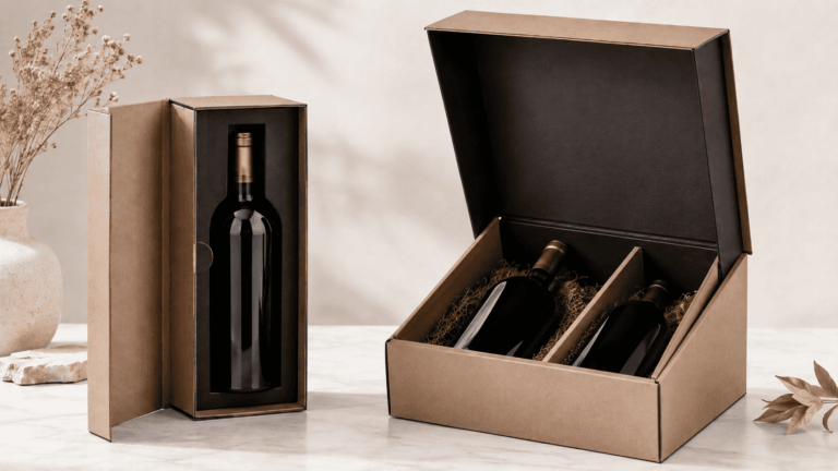
When a project uses a rigid or foldable cardboard structure, the Sammlung von Weinkartons aus Pappe can provide useful format references before the final specification is confirmed. The actual construction should still follow the bottle dimensions, presentation requirements, insert design, and finishing plan.
For custom wine box projects that require coordination between structure, printing, color, and finishing, TopWinePack supports the transition from approved specifications to production. We focus on custom wine packaging projects, so printing decisions can be developed around the specific structure and visual requirements of each order.
If the artwork, material, and color requirements are already prepared, discuss your wine box printing requirements before final sample approval. Providing the intended substrate, artwork files, color references, and finishing requirements allows the production plan to be reviewed more accurately.
Schlussfolgerung
Good wine box printing is less about choosing a single “best” color system and more about keeping the artwork, stock, proof, and press setup aligned.
A photo-heavy design will usually lean on CMYK. If the box depends on one exact brand shade, a Pantone spot color can give the printer a clearer target. Neither method removes the influence of paper, lamination, finishing, proofing, or production conditions.
For packaging teams, approving the full visual system is more useful than approving one isolated color value. A controlled sample, clear specification, and repeatable production reference provide a stronger basis for consistent custom printed wine boxes.
Häufig gestellte Fragen
Q1: Is Pantone better than CMYK for wine box printing?
A1: Not by default. If the box carries photography, gradients, or a lot of color, CMYK is usually the practical route. Pantone is more useful when one solid brand color needs a defined reference. A wine box can also use both in the same design.
Q2: Why can a Pantone color look different on different papers?
A2: The same Pantone ink can read differently once the paper changes. A white coated sheet, an uncoated stock, and a darker textured paper do not reflect or absorb ink in the same way. That is why the approved sample should be checked on the actual stock planned for production.
Q3: Should a physical sample be approved before mass production?
A3: Yes, when color, paper, or finishing matters to the final appearance. The sample lets the team catch a mismatch before the full run begins and gives production a physical reference to work against.