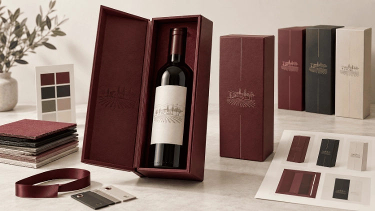

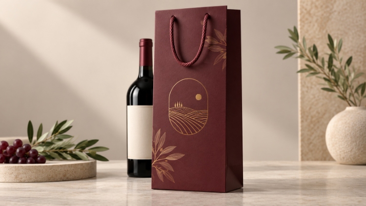
A winery brand mark might look great on a flat design file. However, it could easily vanish into the side fold of a completed wine gift bag. Tiny metallic lines can also break apart on a rough sheet. These issues have distinct causes. The first problem relates to the dieline. The second issue stems from the printing surface. When creating custom wine gift bags with logos, you must make a key choice right away. You need to decide which design elements must stay visible after folding. You also need to pick a finish that accurately shows those details on your selected paper.
What Makes a Printed Wine Gift Bag Look Professional?
A standard single-bottle carrier features a narrow front panel and two side gussets. These side sections partially hide themselves when the item stands upright. Proper logo placement is vital here. Graphics put near any vertical fold might seem unaligned. This happens even if the art is perfectly centered on the flat sheet. Because of this, your layout file requires true panel borders. It also needs the bottom crease, glue seam, and handle fixing locations. Simply using the outer dimensions is never enough.
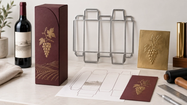
A detailed vineyard picture and a simple monogram have distinct needs. Thin plant lines or delicate letters require plenty of clear space. This space helps them stay sharp after printing. Meanwhile, a big symbol can easily fill the narrow space without spilling over into a side area. Your digital proof must show the handle in its active lifting position. A dangling string loop could easily block the upper part of your brand mark.
Which Paper Materials Suit Custom Wine Gift Bags?
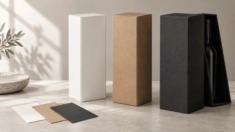
Picking the right material starts with your visual design. A smooth, light-colored sheet provides a neat background for colorful drawings. Meanwhile, kraft paper alters how ink colors actually look. A deeply rough surface can easily break up delicate metallic lines. You must select your visual style first. After that, the material structure needs to support the heavy bottle weight. It must also handle the base fold and the strap attachment securely.
White Cardstock and Coated Paper
White cardstock works very well for bottle photography. It also suits drawings featuring soft skies or gentle color fades. Using coated paper can help preserve tiny printed elements. However, the end result always relies on the specific layer and the press method. Your design might mix a photo background with a shiny gold badge. If so, that badge requires a separate finishing layer. This setup ensures you can check the foil registration independently from the four-color printing process.
Kraft and Uncoated Papers
When using natural kraft paper, the brown base color shows right through the printed ink. Dark text and bold drawings pair nicely with this earthy tone. However, soft pictures and smooth color shifts are quite difficult to print accurately. They rarely match a bright monitor preview. You should always approve this raw style on the actual material. This step is highly important if your corporate image depends on a very specific light hue.
Textured and Specialty Papers
An embossed or linen-style finish alters how the sheet touches the ink or stamping die. A broad badge will usually stay easy to read. In contrast, the tiny edges of a text mark might display noticeable gaps. You must test the tiniest parts of your design before committing to textured paper. Do not make your choice by just looking at a big mark on a small fabric swatch.
How Do Printing and Finishing Methods Change the Result?
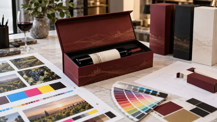
A realistic vineyard photo belongs strictly in CMYK files. Meanwhile, a shiny metallic badge and any selective UV gloss require distinct, aligned layers. Merging these elements into one flat picture creates confusion. It hides the exact point where standard pressing stops and special finishing starts.
Four-Color Printing for Full Artwork
Four-color printing is ideal for realistic photos and colorful drawings. It also works well for background patterns that stretch across the front panel. The exact same image might look much warmer on uncoated paper compared to a slick coated sheet. This color shift happens even if the digital document stays exactly the same. An RGB monitor display can never confirm the true final ink tone. You must always review the approved color reference on the actual material meant for mass production.
Your brand mark might rely heavily on a unique corporate hue. If that happens, you must agree on a precise spot color target or a verified CMYK mix. Document this exact decision directly in your print specification. Finally, verify this hue on the chosen material before the factory starts making the bags.
Foil Stamping for Focused Metallic Detail
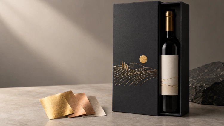
A shiny crest builds visual contrast by bouncing light. Standard yellow ink simply cannot copy this bright effect. On a slender carrier, a single metallic badge placed near the middle usually works best. It has plenty of space to stay crisp. A large decorative border reaching toward the edges often struggles to remain sharp. You must carefully measure the thinnest text and line widths. Do this before sending the layout file to the factory for die creation.
You must align the metallic layer directly against the dieline. Keep it safely away from folding lines, trimmed borders, and punch holes. The shiny art must never cross over a support patch that will eventually hide the graphic. A physical pressed sample will reveal the truth. It shows if the tiny shapes copied perfectly via foil stamping. It also proves if the badge stays in the proper spot after the item takes its final folded shape.
UV Finishing and Surface Contrast
You must never treat UV printing and selective UV gloss as the exact same thing. UV-curable ink refers to a specific way of applying color. In contrast, a targeted gloss treatment creates an extra visual shine. You might want a highly glossy mark sitting on a dull background. If so, your pricing quote and physical proof must state this contrast clearly. Simply writing “UV finish” is far too vague.
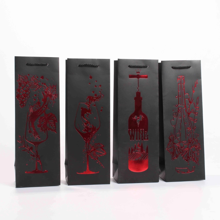
Inside the paper wine bags collection, one dark board style mixes four-color printing with a red-gold shine. Meanwhile, a white cardstock version features foil stamping alongside UV printing. These specific item setups display very different surface styles. They do not produce identical results. A shiny element on dark material requires a completely unique visual inspection compared to flat graphics on a bright white sheet.
Where Should a Logo Be Placed on the Bag?
Front Panels, Gussets, and Safe Areas
A factory dieline marks the front panel, side gussets, bottom fold, and glue flap clearly. You must place your graphic right inside the clear front area. Make sure to agree on all necessary border spaces before resizing the art. Putting the symbol right in the middle of the flat, open sheet is a bad idea. That mistake will leave your graphic in a terrible spot on the built item.
A continuous pattern can safely stretch onto the side gussets. Missing a tiny piece of a repeating shape is not a big deal. However, cutting off a piece of your company name looks very bad. Your drawing might intentionally wrap around a corner. If it does, the digital proof must display both the flat layout and the assembled item. The folding line completely alters which section of the picture stays visible to the buyer.
Handle Openings and Carrying Movement
Strap connections take up actual room in the top section. Punched circles and their support cards can easily hide your graphics. A rope loop often drops down over the front face during lifting. A cut-out hand hold physically removes a chunk of the material. Your final approved file must display these functional parts in their exact final spots. A graphic put right under the top edge might vanish entirely when someone holds the item.
How Should Printed Wine Bags Be Checked Before Production?
Two distinct proof types answer very different questions. A flat printed page displays ink tones, metallic transfer quality, and sharp line details before gluing starts. A fully built bag shows if your mark sits perfectly between the visible creases. It also proves if the side joint cuts through a picture. Finally, it demonstrates how the strap rests against the decorated exterior.
You must compare the completed front panel against your official color reference using steady, bright lighting. Look closely at the tiniest words and the borders of any shiny elements. Next, angle the item to check how the metallic or shiny spots catch the light. A misplaced shiny badge is a serious problem. A thin line vanishing into a crease is also a major layout mistake. These errors matter deeply, even if the total package appears pretty.
You should put the actual glass bottle inside the prototype. Doing this might reveal a bending bottom or a twisted strap support. It could also expose broken ink along tight creases. A quick lifting test will easily highlight these physical flaws. However, this simple check cannot provide an official weight limit certification.
How Do Printed Bags Fit a Wider Wine Gift Set?
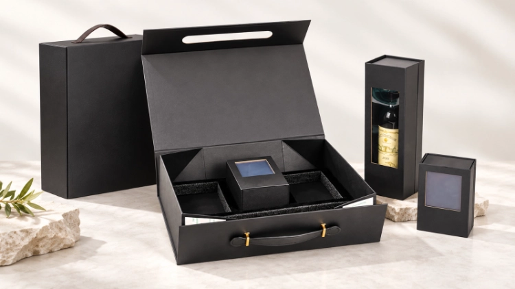
A carrier made strictly for a naked bottle might snag on the sharp edges of a hard presentation box. You must measure the widest section of the loaded present. Always leave extra space for any metal latch or sticking-out ornament. The bottom floor must hold that exact shape securely. It should never allow the internal box to lean over or rub harshly against the walls.
Your corporate identity might need a modified manufacturing finish on the exterior carrier. For example, a shiny crest on the hard box could become a basic printed symbol on the outer paper. The wine bag selection guide evaluates various giving styles. After you pack the item, verify that the strap drops away from the printed mark. Also, ensure the internal goods stay perfectly straight.
What Belongs in the Final Wine Bag Specification?
Your factory instruction sheet requires the packed weight and the final built sizes. It also needs the specific paper grade, handle fixing style, and verified ink tones. You must list all shiny or glossy zones clearly. Always keep special finishing layers isolated on the dieline. Make sure to name holiday design files and order amounts by their specific version.
The broad wine bag range from TopWinePack includes paper, soft felt, and faux leather options. A pricing document for a printed paper carrier must state the exact material type. It must also list the specific graphic finishing method. Keep in mind that not every shiny effect works on every surface.
Sometimes a hard presentation box requires a matching outer carrier. When this happens, TopWinePack can easily align both items. The outer carrier can feature the exact same corporate hue as the box. However, it might use a much simpler graphic style on its bending walls.
You might want to request a printed wine bag sample. To do this, you must supply the loaded sizes, the factory dieline, and your graphic documents. You also need to share your material selection and special visual requests. This information lets the maker build a prototype. You can then test that prototype for crisp graphics and a proper physical fit.
Conclusion
The completed front panel, the material texture, and the strap location control how a graphic looks during transport. When ordering custom wine gift bags with logos, a fully built prototype is highly valuable. It remains the absolute best tool for checking all these visual pieces at the exact same time.
FAQs
Q1: Which printing method works best for custom wine bags with logo designs?
A: A basic solid graphic might look great with standard pressing or a specific color reference. On the other hand, complex colorful drawings usually require CMYK processing. Using foil stamping adds a brilliant metallic touch. The right choice always relies on your chosen material, visual design, order volume, and preferred final look.
Q2: Can foil stamping be used on textured paper wine bags?
A: It is certainly possible. However, a rough surface can easily disrupt tiny metallic details and sharp borders. You must check the exact material and metallic pairing using a physical prototype. This testing is crucial if your graphic includes tiny words or very thin strokes.
Q3: Should a wine gift bag be sampled with a filled bottle?
A: Yes, absolutely. You must test the fully built carrier using its actual intended contents. This step helps you check the physical shape, strap location, and base strength. It also verifies graphic clarity and special effects near the creases. Keep in mind that a simple lifting test never replaces a formal factory weight certification.